Papa John’s redesigns its logo and stores

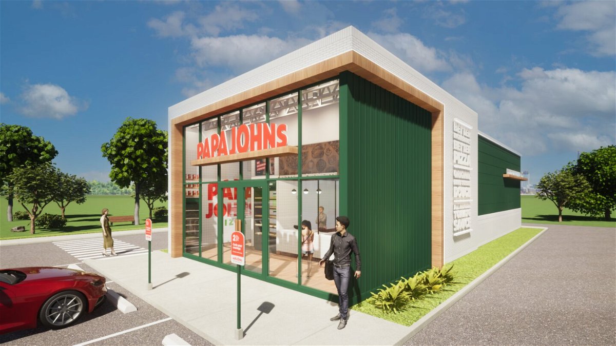
A rendering of a new Papa Johns store
By Danielle Wiener-Bronner, CNN Business
Papa Johns is the latest restaurant brand to give itself a makeover.
The pizza chain on Tuesday unveiled a number of changes, including a new logo, new advertising and new restaurant designs.
The updated logo ditches the word “pizza” and removes the green border around “Papa John’s.” Instead, it just says “Papa Johns” in block red letters. Gone, too, is the possessive apostrophe after “John.”
Papa Johns previously tweaked its messaging in 2018, when it speedily distanced itself from its controversial founder and former CEO John Schnatter.
But this redesign is not about putting more space between the brand and Schnatter, said Max Wetzel, the company’s chief commercial officer. Instead, the changes are geared toward spotlighting the chain’s ingredients and refreshing the look of the brand and its restaurants, he said.
Advertising and messaging will now use an updated color palette drawn from the brand’s ingredients, such as green for basil, red for tomato and white for dough, Wetzel noted. The new font used in advertising is “inspired by our stretchy dough,” he said. Ingredients will also be called out in billboards and showcased in photos in restaurants.
Updated locations will feature changes to the kitchen as well as an open floor plan and tweaks designed to make it easier to take orders out, including self-service check out at pick-up counters.
Customers can expect a “gradual change” in shops, said Amanda Clark, chief development officer at Papa Johns. “It’ll be a soft conversion,” she said. Papa John’s plans to start building stores with the new design toward the end of the year, she said.
Papa Johns is somewhat late to the redesign party. Over the past year, a number of chains have made similar changes to their branding and restaurant designs.
In November 2020, McDonald’s announced that it was rolling out new packaging with a “modern, refreshing feel.” Burger King unveiled a new “minimalist” logo in January, as well as a new font and new signage featuring colors inspired by its food. McDonald’s, Burger King and others also announced changes to their restaurants and drive-thrus to make them more accommodating to customers who want their meals to go.
The-CNN-Wire
™ & © 2021 Cable News Network, Inc., a WarnerMedia Company. All rights reserved.